No one needs to be convinced that a website is the business card of any business. Having a professional website is practically the responsibility of any entrepreneur who wants to attract customers online. Saving at this stage is almost always counterproductive, so it’s a good idea to pass on your work to a web specialist. Below is a list of 10 errors on the website through which we may lose customers.
1. Outdated website
The web development industry continues to grow rapidly. An un up-to-date site that is not adapted to current trends can effectively scare away users. Nowadays, it is almost necessary to have a responsive website, and even better if we create a mobile version of it.
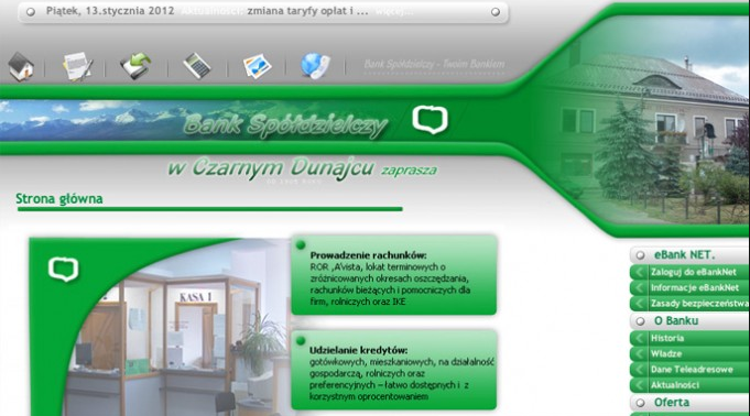
(Source): http://www.bsczarnydunajec.pl/2012/01/oferta-kredytowa-dla-mlodych-malzenstw/
2. Inappropriate website address
Choosing the right page address is important when it’s popular and remembered by a potential customer. It must not be too complicated and must reflect its subject matter or promote the name. Choose popular domains such as .pl or .com.
3. Poor website navigation
Faulty website navigation significantly reduces conversion because the user usually has trouble finding the right information. The customer from each subpage must be able to move smoothly to all other tabs. It is worth entrusting the planning of the website to an internet marketing specialist and programmee.
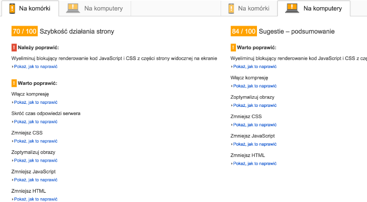
(Source): https://developers.google.com/speed/pagespeed/
4. Long loading of a website
A page overloaded with various animations or graphics loads very slowly, which can effectively scare away the client who needs quick information. There is a chance that after too long waiting, the reassuanced customer will go to the competition side. Every second counts here.
5. Inappropriate colors
Sometimes we may overdo it with the colors on the website, making it illegible and can distract the user. Currently, the trend for “clean” style dominates, which is distinguished by elegance and professionalism. It is worth using muted colors such as white and gray as a base, complementing the colorful accents that emphasize the nature of the activity.
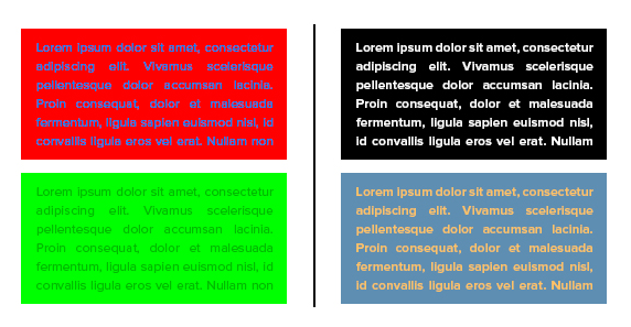
(Source): https://www.marketing101.pl/formatowanie-tekstu
6.Outdated information
By accessing our website, you expect up-to-date and valuable content. Because thanks to them our site lives and attracts more users. We can captivated customers with nice graphics, but we will definitely scare off their unprofessional content.
Click below on “Like this page” and you will always be kept informed about new articles from my blog.
7. Poorly prepared graphics and animation
The right design, tailored to the nature of our business and target audience is now a fundamental issue for a professional website. Many companies that do not go with the times still have amateur photos, so the user is unlikely to take our company seriously.

(Source): http://www.zaproszenia.sklep.pl/czcionki.php?id=czcionki&c=30
8. Unreadable font
If for a while the user will wonder what is written on the website – he will not return again. Wacky fonts are definitely illegible and cause annoyance among visitors.
9. No search engine
If our site is full of content, it is a good idea to place the search engine on it in a prominent place, otherwise the user will effectively be discouraged during the search.
(Source): http://unbounce.com/101-landing-page-optimization-tips/
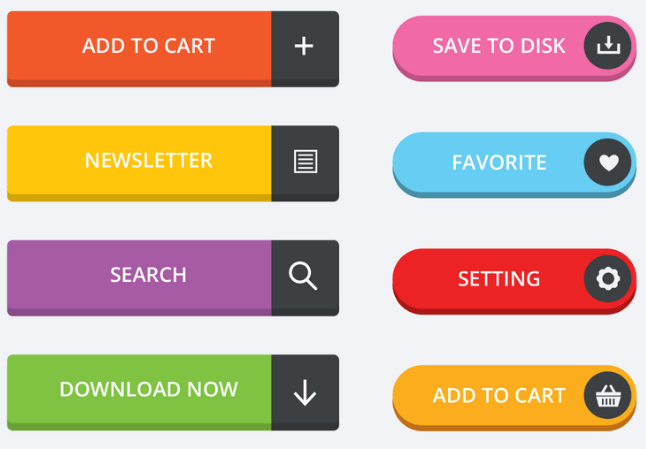
10. No call-to-action buttons
If you don’t have call to action buttons placed, it can even kill the conversion. Each subpage must have a purpose and be able to perform actions by the user. Properly created call-to-action buttons can literally guide the customer by the hand. In this case, it is worth seeking advice and support from an experienced internet marketing specialist.
Check out the previous article about why you should have an effective website.